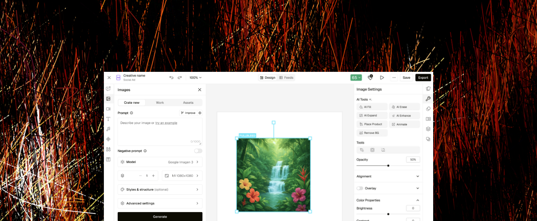
A creative workspace, coming together.
Pencil is a generative AI platform for creating and scaling advertising content. As the product grew, its editors evolved across different teams and timelines. Similar tasks started to feel different depending on where you were working.
I owned the audit, interaction framework, component specifications, usability testing, and cross-team alignment. Our first release brought image generation and the Fill, Expand, and Enhance tools directly into the Social Ads Editor.
The opportunity was bigger than consistent controls. It was keeping people in their creative flow.
A small change meant a long way around.
Users generated an asset, saved it to a library, and switched to the ad editor to assemble their creative. If the asset needed a tweak, they left the ad editor, returned to the original tool, made the change, and brought it back.
A formal UX audit across image, video, ad, and variant workflows surfaced four recurring sources of friction.
Different signals for the same action
Generation states used different indicators, placements, and timing cues. Users couldn’t build a reliable expectation of what generating looked like.
Inputs scattered across the sidebar
Information needed for one generation task was split across navigation items, making users move between sections mid-task.
Essential and advanced controls competing
Controls appeared at the same level, making the basics harder to find and adding complexity before it was needed.
Model selection that kept changing
A core action varied in placement, visibility, and interaction pattern across editors.
Bring the tools to where the work converges.
I chose the Social Ads Editor as the starting point for unification. It was where assets came together into an ad, making it the natural place to support generation and refinement.
This shifted the goal from making separate editors look consistent to removing the need to leave the ad editor for the supported image workflows.
Phase 1 focused on images. Video generation, video refinement, and expansion into Email and Display editors were part of the broader roadmap.
Learn once. Keep moving.
I defined a shared interaction framework covering canvas behavior, tool hierarchy, and core actions. Component specifications gave engineering a reference for generation feedback, model selection, naming, and panel architecture.
Essential first. Advanced when needed.
The hierarchy separated the controls people needed routinely from more specialized options. Capability stayed available without demanding equal attention from every user.
A common language across teams.
Some editor-specific patterns had to be revisited. Although useful in isolation, they introduced inconsistencies across the product. I framed the tradeoff around the long-term cost of maintaining divergent interactions as the platform grew.
Making progress through disagreement.
Compare layouts, not opinions.
The placement of Fill, Expand, and Enhance prompted debate about left versus right panels and how tools should interact with the canvas. I advocated testing two layout options to inform the decision.
Ship with the issue visible.
I had also flagged potential confusion around panel names. Leadership retained the existing names for v1, and usability testing later revealed hesitation at those panels.
I documented the finding, proposed improved names, and secured agreement to address them in v2. This kept the launch moving while giving the issue an explicit follow-up path.
A known imperfection needs a clear next step, not a quiet disappearance from the backlog.
Estimated impact
Metrics below are estimated based on workflow analysis, session observations, and team feedback. They reflect directional improvements observed post-unification, not instrumented A/B test results.
Eliminated the context-switch bottleneck
Users no longer needed to leave the ad editor to tweak assets. The highest-friction workflow — the back-and-forth between editors — was removed entirely.
Faster multi-editor onboarding
New users learned one interaction model and applied it everywhere, rather than relearning patterns per editor.
Reduced internal overhead
Design and engineering teams had a shared framework to build against, making new feature development faster and more predictable.
Improved product coherence
Sales, CS, and marketing teams could present Pencil as one product rather than a collection of editors.
What I’d measure next
- How often users switch editors within a task.
- Time to a first successful export for new users.
- Retention among users working across multiple editors.
- Support requests related to editor confusion.
The workflow was the design problem.
The most important decision was choosing what to unify around. Standardizing individual controls addressed one layer of friction. Bringing creation and refinement into the ad workspace addressed the repeated handoff itself.
The naming disagreement reinforced another lesson: documenting a known issue and agreeing on a follow-up can protect both delivery and the user’s needs.
The launch, from Pencil.
Read Pencil’s feature announcement about bringing image generation and refinement into the Social Ads Editor.
PENCIL / FEATURE ANNOUNCEMENTEditor unification: from idea to ad in one place Read on Pencil’s website